 Starter Kit
Branding and UI
The application UI is split into UI components. They are built as macros and fragments, offered by the default server side template engine Nunjucks. All components use Tailwind CSS styling. We aimed to deliver an easy to read and understand architecture, with less than the usual amount of abstractions, but also to offer a good basis of component driven architecture.
Important
Don't get confused. Apostrophe core offers a custom Nunjucks tag - Async component. This is not what we are referring to. UI Component in the current context is an abstract unit, used to build the application UI. For example, this is the primary button UI component delivered via Nunjucks macro.
{# modules/theme/views/button.html #}
{% macro primary(label, options, href = false) %}
  ...
{% endmacro %}
{# modules/theme/views/button.html #}
{% macro primary(label, options, href = false) %}
...
{% endmacro %}And here is the product card - a Nunjucks fragment:
{# modules/theme/views/card.html #}
{% fragment product(item, wide = false) %}
  ...
{% endfragment %}
{# modules/theme/views/card.html #}
{% fragment product(item, wide = false) %}
...
{% endfragment %}And we use those as UI components:
{% import "theme:button.html" as buttons %}
{% import "theme:card.html" as cards %}

{{ buttons.primary('My button') }}
{% render cards.product(item) %}
{% import "theme:button.html" as buttons %}
{% import "theme:card.html" as cards %}
{{ buttons.primary('My button') }}
{% render cards.product(item) %}Throughout this documentation, when we are saying "component" we do mean "UI Component" as explained above. Learn more about Nunjucks templates
TIP
We've put a lot of efforts in documenting our code. Every template contains useful information. There is a good chance to find answers of your questions that are not to be found in the documentation in a developer code comment.
Branding
Logo and favicon.ico
The logo and favicon.ico are dynamic and can be controlled via the Global configuration. You can opt out from this behavior and implement static logo and/or favicon.ico:
- Remove
faviconandlogofields from the schema tomodules/@apostrophecms/global/index.js - Replace
modules/theme/public/logo.svgor your own, e.g.modules/theme/public/logo.png - Adapt the
widthandheightvariables inmodules/theme/views/logo.html. Keep in mind, those are only needed for aspect ratio (calculated by the browser). Responsive size restrictions are applied in the header and footer fragments. - If you have added logo file, update the path in
modules/theme/views/logo.html, for example{%- set url = apos.asset.url('/modules/theme/logo.png') -%} - Add
modules/theme/public/favicon.ico, openviews/layout.htmland modify
{% block extraHead %}
  {%- if data.global.favicon -%}
  <link rel="icon" href="{{ data.global.favicon._url }}" />
  <link rel="icon" href="{{ apos.asset.url('/modules/theme/favicon.ico') }}" />
  {%- endif -%}
{% endblock %}
{% block extraHead %}
{%- if data.global.favicon -%}
<link rel="icon" href="{{ data.global.favicon._url }}" />
<link rel="icon" href="{{ apos.asset.url('/modules/theme/favicon.ico') }}" />
{%- endif -%}
{% endblock %}Color scheme
The theme uses a brand color palette and provides a number of predefined brand color schemes. You can choose and modify the predefined palette configurations, or introduce new one. Detailed instructions can be found in the Brand Color Scheme section.
UI Components
All components are part of the theme modules and can be found in the root of modules/theme/views folder. You are free to modify and extend them (add new components). The additional folder modules/theme/views/design-system does not contain a code used in the application. It's a part of the design-system used during the development of the project. You can find more information in the Design System section.
The components are the building blocks of the application UI. For example, no matter if you are introducing a widget or directly embedding a "Promo" section in your pages, you are importing the relevant promo-widget.html and just passing the expected arguments, the visual result will be always the same. This approach leads to a predictable, consistent and composable UI. The -widget suffix is something we don't usually use when naming purely UI components, but it makes sense in the context of this project. It points out that the component is primarily (but not exclusively) used as a widget.
You can modify any existing component or introduce a new one inside modules/theme/views and profiting from the benefits of the composition architecture of the application - modifying a chosen component will guarantee that every page using it will be updated with that change. For example, modifying button.html so that it fits your project requirements, will guarantee that all the buttons, including those used in another UI components, will be updated.
Client side sources
The UI components are organized inside of macros or fragments. There is no need for additional styling files, because they use Tailwind CSS. However, some components do need a client side JavaScript in order to deliver some kind of interactivity. In such cases, components can add their client side sources to modules/theme/ui/src/components/. All component client side sources are then bootstrapped in modules/theme/ui/src/index.js. This possible because of the offered by Apostrophe internal build system.
Extending the UI
Let's assume you want to add a new "accordion" feature. Here are the possible implementation steps:
- Add your HTML markup as
modules/theme/views/accordion.html. It is wise to use afragmentin order to render your markup (read further for more information why). - Add
modules/theme/ui/src/components/accordion.jsfor your client side implementation. You can use vanilla JavaScript or third party library to deliver the feature based on the markup produced byaccordion.html. - One way to do it is to, e.g.
export { init }inaccordion.js. This method should read the DOM, find DOM elements of interest, and apply the desired client side logic. In this case, you also need to import and register your initialization logic:
// modules/theme/ui/src/index.js
import { toggle as mobileNavToggle } from './components/mobile-nav';
import { init as initGalleries } from './components/gallery';
import { init as initTabs } from './components/tabs';
import { init as initAccordion } from './components/accordion';

export default () => {
  const theme = window.apos?.modules?.theme || {};

  // Components
  theme.mobileNavToggle = mobileNavToggle;

  // Register
  window.apos.modules.theme = theme;

  // Apostrophe integration - global events
  const onReadyAndRefresh = () => {
    initGallery();
    initTabs();
    initAccordion();
  };
  apos.util.onReady(onReadyAndRefresh);
};
// modules/theme/ui/src/index.js
import { toggle as mobileNavToggle } from './components/mobile-nav';
import { init as initGalleries } from './components/gallery';
import { init as initTabs } from './components/tabs';
import { init as initAccordion } from './components/accordion';
export default () => {
const theme = window.apos?.modules?.theme || {};
// Components
theme.mobileNavToggle = mobileNavToggle;
// Register
window.apos.modules.theme = theme;
// Apostrophe integration - global events
const onReadyAndRefresh = () => {
initGallery();
initTabs();
initAccordion();
};
apos.util.onReady(onReadyAndRefresh);
};- We simply import and add our
initmethod toonReadyAndRefresh, so that Apostrophe can execute it for us on page initialization, or when refreshing the page (when content managers apply a change on that page). - You can export any number of methods and register them globally. This can be useful if you want to provide widget specific features. For example, we could do
theme.myFeature = myFeatureabove. After that, our widgets will be able to callwindow.apos.module.theme.myFeature()inside theirplayer. Learn more about client side code for widgets in the official Apostrophe documentation.
TIP
You can use the existing components as a blueprint for your own features. For example, gallery.js showcases implementing a client side feature via global initialization, while mobile-nav.js shows how to register a global toggle method, later used in header.html with onclick HTML attribute.
macro vs fragment
When to use a macro and when a fragment? An important question in order to minimize your future refactoring efforts.
Use macro when:
- No
fragment,areaorcomponentor any other asynchronous tag is expected to be rendered inside of it. - No
__t()usage is expected (i18n). - No "body" (the macro special function
caller()usage) is expected.
If you fail to evaluate any of the above to true - use a fragment. If you are in doubt - just use fragment.
Tailwind CSS
Tailwind configuration can be found in the root tailwind.config.js file. Refer to the official Tailwind CSS documentation for more information about the options you can set.
The only deviation from the standard configuration is a special color brand introduced in the application. It's explained in details below.
You can modify any Tailwind class used in the application to fit your project needs.
WARNING
A common mistake when working with Tailwind CSS is concatenating classes. The Nunjucks components (and any client side framework) allows dynamic use of classes. This will work well with Tailwind unless you obfuscate the class itself. For example:
{# GOOD #}
{% set cls = ' text-red-700' if error else ' text-green-700'  %}

{# BAD - won't work #}
{% set more = ' p-' + padding  %}

<span class="text-sm{{ cls }}{{ more }}">...</span>
{# GOOD #}
{% set cls = ' text-red-700' if error else ' text-green-700' %}
{# BAD - won't work #}
{% set more = ' p-' + padding %}
<span class="text-sm{{ cls }}{{ more }}">...</span>Bootstrapping
The Tailwind bootstrap file modules/theme/ui/src/tailwind.css contains
- The Tailwind recommended setup (core components and utilities)
baselayer, taking care of the global typography and adding some Apostrophe specific global styling (likepager).componentslayer with some additional useful typography classes (t-display,t-subtitle,t-caption,t-link,t-richtext)
INFO
The theme is using the core Tailwind @tailwindcss/typography plugin (prose class) to handle dynamic markup, provided by Apostrophe core @apostrophecms/rich-text-widget. This is done via the className option per instance of the widget. You can control the custom pages rich text behavior with just modifying the .t-richtext component in modules/theme/ui/src/tailwind.css. Some widgets are using rich text in a specific context and are providing specific className instructions to their owned rich text instances.
Font
The configured in tailwind.config.js font Inter var is loaded with inline style in views/layout.html to prevent the Flash of Unstyled Text (FOUT). You can replace it with your own font. The font itself can be found in modules/theme/public/fonts.
Brand Color Scheme
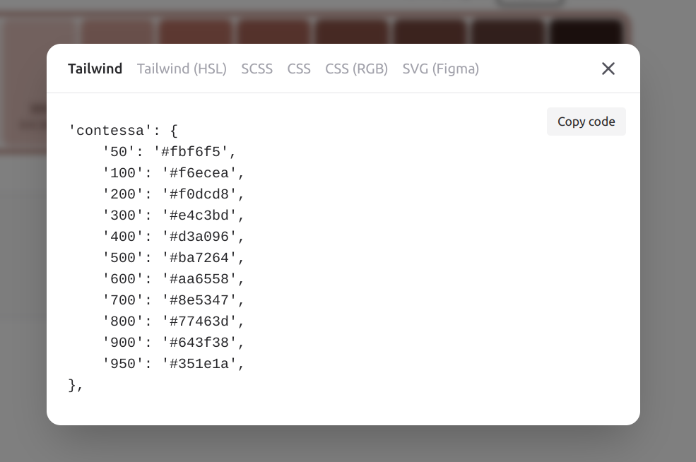
The starter kit is extending the default Tailwind CSS color scheme and adding named color palette brand, while keeping all other shipped core colors intact. The branding is delivered through a combination of the brand and the Tailwind core gray palettes.
The brand palette follows the Tailwind colors standard - named colors ranging from brand-50 to brand-950. Additionally, the configuration introduces a DEFAULT value for both brand and gray palettes, which allows syntax bg-brand, text-gray, etc. The brand and gray defaults are respectively brand-600 and brand-300.
One additional feature offered by the starter kit is a number of predefined brand color palettes and the option to choose a brand palette on build time. You can find the existing color palettes in the colors/ folder. default.json (Jelly Bean) is the brand palette used by default, when no preference is specified.
You can build the application with the desired brand palette in production:
APP_BRAND=purple npm run build
npm startAPP_BRAND=purple npm run build
npm startOr you can start in development:
APP_BRAND=purple npm run devAPP_BRAND=purple npm run devWARNING
You can't switch brand palette or choose brand color on runtime. Tailwind CSS is generating and tree-shaking the styles on build time. This won't work as you might expect:
APP_BRAND=pink npm run build
# The application will still use pink color palette
APP_BRAND=purple npm startAPP_BRAND=pink npm run build
# The application will still use pink color palette
APP_BRAND=purple npm startYou can find a preview of the available brand palettes in the user guide section.
Add your own brand palette
First you need to translate your desired brand palette as Tailwind standard named palette. There is a tool that can help you do that - https://uicolors.app/create. Create your color scheme and while in edit mode, use the "Export" link.
Convert the "Tailwind" output to a JSON, paste it in a newly created file colors/mybrand.json. Add an appropriate DEFAULT property (see colors/default.json for an example). Now you can build:
APP_BRAND=mybrand npm run buildAPP_BRAND=mybrand npm run buildor directly start in development
APP_BRAND=mybrand npm run devAPP_BRAND=mybrand npm run devTIP
In order to get good results (contrast) when adding your own brand palette, you should ensure a good contrast of the DEFAULT brand color with white. The gray color palette is generally not mixed with the brand. If your brand colors requirements can't fulfil the above, you might need to go through all components and adapt them. It's also possible to use the dark mode Tailwind feature to produce a dark design (and you can force it as the default and only choice). In this case, you would need to add the dark mode instructions to all components.
Icons
An SVG icon sprite is auto generated from modules/theme/icons folder. You need to add your own icons SVG and do npm run build:sprite or just rebuild the project and the icons will appear as choices in the appropriate schema fields (for example look at the headerCtaIcon field in modules/@apostrophecms/global/index.js).
You can embed any icon available in the folder above in the site via the icon.html macro. For example for an icon SVG modules/theme/icons/heart.svg, in your templates:
{# default size, equals to 'md' #}
{{ icon.svg('heart') }}
{# add custom class to control the color
  or just do it in the parent element #}
{{ icon.svg('heart', cls = "text-brand") }}
{# predefined sizes #}
{{ icon.svg('heart', 'sm') }}
{{ icon.svg('heart', 'md') }}
{{ icon.svg('heart', 'l') }}
{{ icon.svg('heart', 'xl') }}
{# custom size #}
{{ icon.svg('heart', 'h-[96px] w-[96px]') }}
{# default size, equals to 'md' #}
{{ icon.svg('heart') }}
{# add custom class to control the color
or just do it in the parent element #}
{{ icon.svg('heart', cls = "text-brand") }}
{# predefined sizes #}
{{ icon.svg('heart', 'sm') }}
{{ icon.svg('heart', 'md') }}
{{ icon.svg('heart', 'l') }}
{{ icon.svg('heart', 'xl') }}
{# custom size #}
{{ icon.svg('heart', 'h-[96px] w-[96px]') }}The project uses the Outline versions of Heroicons (with the exception of the internally developed social icons). Any icon from this package will work out of the box. The SVG files are automatically optimized.
You can find the build script in scripts/make-svg-sprite.
Figma source
You can use the community Figma document, containing the Design System, component library and page prototypes, as your project base.
Helpers and Utils
The helpers.html fragment delivers container and section layout helper fragments. They are used to control the horizontal and vertical spacing respectively in the page layouts.
The utils.html contains only the attrs macro. It's a useful utility for building HTML attributes from object variables.
You can add more helpers and utilities according to your project needs.